Friday 27 November 2015

Newspaper Front Cover Progress 2 - Font

I used 1001 fonts in order to find the perfect font which matched the one used on the Evening Chronicles front covers.
When locating the font I compared the one used on already existing newspapers to ones I could find on the website.
After searching through various amounts of pages of different fonts, I found one called LumberJack.
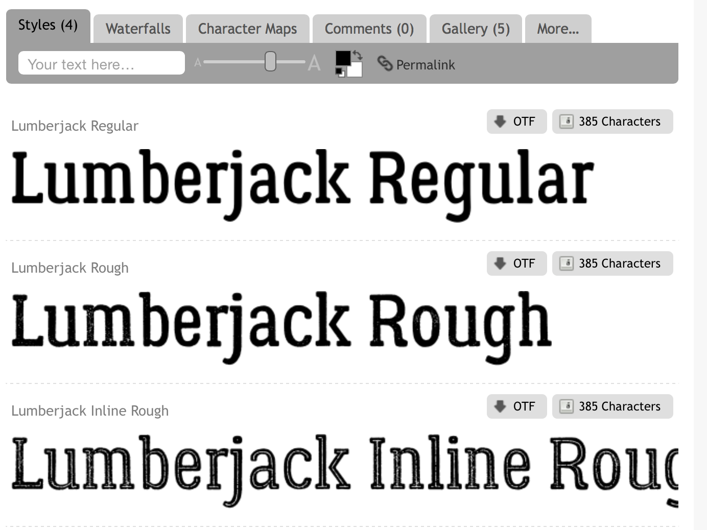
I then had to decide whether I wanted a clean sharp looking font or a rustic looking font, I then chose to use the Lumberjack Regular font and proceeded to use this on my front cover.

Wednesday 25 November 2015

Newspaper Front Cover Progress

In order to ensure that my front cover was going to have the same aesthetic as already existing newspapers, I created the outlines for the side stories and added the coloured blocks which are a recognisable features from the Evening Chronicle.

Friday 20 November 2015

Poster - Final touches.

                                            
Just like this poster which I created at an early stage, I am going to find the perfect font to add onto the bottom of my final poster which I have produce.
 
I will be placing the writing in the same location, across the centre of the bottom of the page. So far I have decided to stick with the word 'read' and I will be writing it in the colour I have chosen for the rest of my newspaper in order to follow my colour scheme.
 

Tuesday 17 November 2015

Poster Progress 4

 This is my nearly complete poster for my newspaper. I came up with various different headlines, some related to the local area which the newspaper will be published in, and some headlines which I have previously seen on other existing newspapers.
Before I could finish off my poster I wanted to see whether having the headlines in front or behind my chosen image of the Tyne Bridge would look the best. After realising it would look messy with the text in front, I decided that my final poster would have the image in front of the text.
 

Friday 13 November 2015

Poster Progess 3

I began adding newspaper headlines onto my poster, this is will allow potential readers to get a quick insight to what stories may be featured in my newspaper.
 
 
To achieve this look I went onto a website called Fodey, typed in my chosen headline then using the snipping tool on the computer, I captured the part of the image I wanted and uploaded it to Photoshop. This is where I began to edit the headline in order to achieve a ripped effect, I used the eraser tool to create this.

Tuesday 10 November 2015

Poster Progression 2

Instead of adjusting the contrast and brightness I chose to just add a filter and move it around.
 
To achieve this look I went to Filter on the toolbar, went onto Sketch then went through the list of options to find this effect.


Poster Progress

This is the image which I have chosen to use on my newspaper poster. This is an image of an iconic bridge situated over the River Tyne.
  I have began to edit the image on Adobe Photoshop, this will allow me to adjust the contrast and sharpness and edit out any pieces I do not want to be featured.
This is how the top half of the poster is going to look. I have erased the sky above the bridge, and next I will begin to adjust the colour on the image in order to achieve the correct look.

Friday 6 November 2015

Newspaper Poster Questionnaire

Create your own user feedback survey